
Every Pantone Color of the Year
Since 2000, the Pantone Color Institute has been sparking conversation among creatives with its Color of the Year selection. Twice a year, our nations send representatives from their color standards groups, who analyze worldwide trends and phenomena to determine the following year's zeitgeist. As a global color authority, Pantone's designation often influences trends and guides artists, businesses, and designers in their work. Starting with the most recent, let's take a look at all twenty-three of Pantone's colors of the year.
2023: PANTONE 18-1750 TCX Viva Magenta

2023's color is Viva Magenta, a joyful red that's packed with strength, bravery, and fearlessness. Inspired by chochineal, a precious and vivid natural red dye, this Pantone color connects us to the vitality of nature amidst our technology-filled world. Viva Magenta inspires a zest for life, unrestrained self-expression, and a healthy dose of rebellion in all of us.
2022: PANTONE 17-3938 Very Peri

For the first time in the history of Color of the Year, a brand new color was created to represent the coming 365 days. Very Peri was conjured to inspire and represent "personal inventiveness and creativity." It grounds us in the calming qualities that blue conveys while its warm purple undertone encourages us to look ahead to dynamic possibilities during this moment of global transition.
2021: PANTONE 17-5104 Ultimate Gray + PANTONE 13-0647 Illuminating

For the second time, the Pantone Color Institute selected two colors to represent a year. The combination of these two colors embodies strength and enduring positivity. Rocked by the uncertainty of the COVID-19 pandemic, 2021 called for a bright hope to buoy the human spirit, anchored in resilience and fortitude.
2020: PANTONE 19-4052 Classic Blue

Classic Blue is lauded for being relatable, tranquil, and dependable. It provides us with a familiar starting point from which we can center our thoughts and consider new possibilities. Leatrice Eiseman, executive director of the Pantone Color Institute, remarked that Classic Blue is "evocative of the vast evening sky" and "encourages us to look beyond the obvious to expand our thinking."
2019: PANTONE 16-1546 Living Coral

In a world where we are increasingly saturated in rapidly changing digital technology, Living Coral invokes authentic and life-affirming connection with others. It is playful and joyful, with its yellow undertone imparting a warming energy. This bright color occurs naturally in the environment, providing us with both a sense of shelter and liveliness.
2018: PANTONE 18-3838 Ultra Violet

Bold and stimulating, Ultra Violet reminded us to be forward-thinking in 2018. Purples are inherently complex and enigmatic colors, often representing individuality, counterculture, and artistic expression. This hue is meant to energize and engage the mind, piquing our curiosity for what mysteries lie ahead.
2017: PANTONE 15-0343 Greenery

Springtime bursts forth in 2017's fresh, yellow-y green color. Known as "nature's neutral," a bright green draws humanity in when we seek to reconnect with the natural world. During a year of social and political unrest around the globe, Greenery represented a growing universal desire to rejuvenate and take a deep breath.
2016: PANTONE 13-1520 Rose Quartz + PANTONE 15-3919 Serenity

2016 marks the first time that the Pantone Color Institute designated two colors to represent a single year. The soft warmth of Rose Quartz and the tranquility of Serenity marry ideas of connection and order. The combo also communicates the increasing blur in traditional gender norms as seen in fashion and other areas of design. A generation of individuals who are less concerned with traditional color usage and more with free expression are represented in this soft blend.
2015: PANTONE 18-1438 Marsala

In 2015, the Pantone Color Institute selected an earthy wine red for its universally appealing richness and grounding brown undertones. The flavorful hue is hearty yet sophisticated and easily translates to many applications, encouraging creativity and experimentation in all contexts. It brings warmth and drama, imparting a bold impression to all it touches.
2014: PANTONE 18-3224 Radiant Orchid

Radiant Orchid exudes confidence and warmth. With its mixture of both cool and warm undertones, this adaptable hue encourages diversity. The pinky-purple is uplifting without being overpowering, managing to invigorate, unify, and promote energetic health for all
2013: PANTONE 17-5641 Emerald
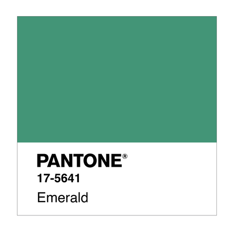
Reminiscent of precious gemstones, Emerald communicates sophistication and prosperity. Our vision sparkles with renewal and rejuvenation that only a green found in our natural environment can impart. In an increasingly complex world, a powerful green with a history of beauty and new life brings a sense of clarity.
2012: PANTONE 17-1463 Tangerine Tango

2012 was given an energy boost with Tangerine Tango. This rich, vivacious reddish-orange charges boldly forward toward a new year, reminding us to recharge and keep looking forward. Its depth evokes the splash of a sunset, the day's last celebration of life before regaining energy for what's to come
2011: PANTONE 18-2120 Honeysuckle

Honeysuckle emboldens humanity to face the world head on. Through this vibrant, warm, reddish pink, we are encouraged to face our troubles with vitality. Visions of honeysuckle flowers remind us of nostalgic springs and summers past, allowing us to reminisce with memories that bring comfort.
2010: PANTONE 15-5519 Turquoise

Turquoise embodies an escape from the stress of daily life. 2010 was a year for personal healing and compassion. Tranquil blue is blended with invigorating green to provide us with the gentle repose we need to recharge. This crisp hue harnesses the calming waters of a clean ocean and nods to the protective qualities that are often associated with turquoise stone.
2009: PANTONE 14-0848 Mimosa

Amidst global economic and political uncertainty, this glowing yellow hue encouraged hope and optimism. Warm like our reliable and reinvigorating sun, humanity can look to Mimosa for comfort during times of unrest. Let yourself get carried away in its energy to spark imagination and creativity
2008: PANTONE 18-3943 Blue Iris

In a progressively more complex world, Blue Iris satisfies the need for stability coupled with a healthy dose of curiosity about its unfolding mysteries. The cool blue foundation keeps us emotionally anchored, while the subtle purple cast gives our souls permission to explore and create magic.
2007: PANTONE 19-1557 Chili Pepper

Chili Pepper is a bold and outgoing celebration of passion. 2007 marked a shift toward using technology as a new horizon for self-expression, and this punchy red hue screams individuality. Emboldened with confidence and the spirt of adventure, people experimented with sharing their personality in new ways and became more connected than ever.
2006: PANTONE 13-1106 Sand Dollar

One of the only neutrals that has ever been selected, Sand Dollar was chosen to convey a growing concern about the economy. It is careful and reserved, aiming to soothe global uncertainty. Reminiscent of sand and stone, the color was also chosen to represent the trend toward natural and organic products.
2005: PANTONE 15-5217 Blue Turquoise

Inspired by a calming, gentle ocean, Blue Turquoise made its splash in 2005. The peaceful hue contains slightly more blue than a true turquoise, conveying an increased sense of serenity
2004: PANTONE 17-1456 Tigerlily

Nature inspired the Pantone Color Institute once again with the induction of Tigerlily. The flowers of the same name have become symbols of wealth, confidence, and pride. This bright orange, in turn, was designated to encourage passion and rejuvenation.
2003: PANTONE 14-4811 Aqua Sky

This breathy blue-green color was honored for its calm, cool qualities. Loved by many for its steadfast presence in nature, Aqua Sky provides the world with clarity.
2002: PANTONE 19-1664 True Red

Associated with love, passion, and power, True Red represents deep emotion. Information on this color decision is scarce, but it is speculated that the Pantone Color Institute may have chosen it in response to the September 11 attacks the previous year.
2001: PANTONE 17-2031 Fuchsia Rose

It is thought that the lively Fuchsia Rose was chosen to balance out the first year's softer color. This bright pink is cheerful, passionate, and playful.
2000: PANTONE 15-4020 Cerulean

Cerulean: the color that started it all. Dubbed "the color of the millennium," this pale blue provided comfort and stability as we entered a new era. It offered us the clarity to reflect on the past and inner peace as we stepped into the unknown future.
Which color of the year speaks to "hue" the most? Show us how you incorporate these vibrant colors into your interior design aesthetic by tagging Walker Edison on social media.